


Website redesign
Refined and completed an existing website with updated UI and structure.
Reusable templates
Created flexible, scalable components for various page types.
Ready for devs
Handoff-ready files prepared directly in Figma.
Website redesign
Refined and completed an existing website with updated UI and structure.
Reusable templates
Created flexible, scalable components for various page types.
Ready for devs
Handoff-ready files prepared directly in Figma.
Website redesign
Refined and completed an existing website with updated UI and structure.
Reusable templates
Created flexible, scalable components for various page types.
Ready for devs
Handoff-ready files prepared directly in Figma.
Website redesign
Refined and completed an existing website with updated UI and structure.
Reusable templates
Created flexible, scalable components for various page types.
Ready for devs
Handoff-ready files prepared directly in Figma.
Website redesign
Refined and completed an existing website with updated UI and structure.
Reusable templates
Created flexible, scalable components for various page types.
Ready for devs
Handoff-ready files prepared directly in Figma.
Website redesign
Refined and completed an existing website with updated UI and structure.
Reusable templates
Created flexible, scalable components for various page types.
Ready for devs
Handoff-ready files prepared directly in Figma.
Website redesign
Refined and completed an existing website with updated UI and structure.
Reusable templates
Created flexible, scalable components for various page types.
Ready for devs
Handoff-ready files prepared directly in Figma.
Website redesign
Refined and completed an existing website with updated UI and structure.
Reusable templates
Created flexible, scalable components for various page types.
Ready for devs
Handoff-ready files prepared directly in Figma.
Website redesign
Refined and completed an existing website with updated UI and structure.
Reusable templates
Created flexible, scalable components for various page types.
Ready for devs
Handoff-ready files prepared directly in Figma.
Website redesign
Refined and completed an existing website with updated UI and structure.
Reusable templates
Created flexible, scalable components for various page types.
Ready for devs
Handoff-ready files prepared directly in Figma.
Challenge
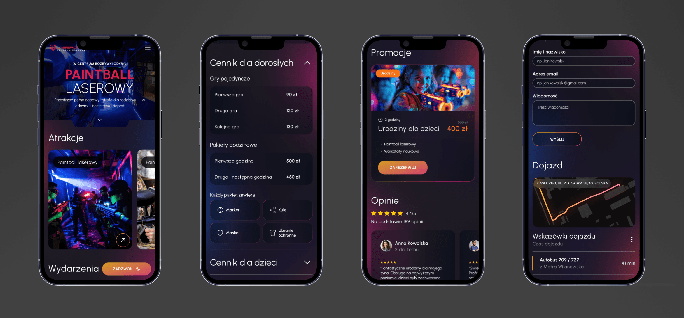
The project goal was to design a new version of the website for a paintball activity center, along with a lightweight design system tailored to the client’s needs. The priority was to ensure visual consistency, scalability, and ease of development. The final deliverables needed to support quick implementation across multiple subpages.
Key business challenges included:
Reusable design patterns - flexible components adaptable to different content types.
Visual consistency - unified rules for color, typography, and layout.
Developer-ready delivery - structured Figma files prepared for implementation.
Time constraints - full project delivery in under 50 hours.
Challenge
The project goal was to design a new version of the website for a paintball activity center, along with a lightweight design system tailored to the client’s needs. The priority was to ensure visual consistency, scalability, and ease of development. The final deliverables needed to support quick implementation across multiple subpages.
Key business challenges included:
Reusable design patterns - flexible components adaptable to different content types.
Visual consistency - unified rules for color, typography, and layout.
Developer-ready delivery - structured Figma files prepared for implementation.
Time constraints - full project delivery in under 50 hours.
Issues identified in the original design

Outdated visual style – The overall look and feel no longer reflected current UX/UI standards or the dynamic, action-oriented nature of the brand.
Lack of visual hierarchy – Key elements such as pricing, contact options, or navigation links did not stand out, making it harder for users to quickly locate relevant information.
Difficult-to-read pricing tables – The pricing section lacked structure and visual clarity, which led to confusion around offers, packages, and additional costs.
Repetitive content blocks – Many sections reused similar layouts without functional variation, which reduced the page’s effectiveness and caused cognitive fatigue.
Issues identified in the original design
Outdated visual style – The overall look and feel no longer reflected current UX/UI standards or the dynamic, action-oriented nature of the brand.
Lack of visual hierarchy – Key elements such as pricing, contact options, or navigation links did not stand out, making it harder for users to quickly locate relevant information.
Difficult-to-read pricing tables – The pricing section lacked structure and visual clarity, which led to confusion around offers, packages, and additional costs.
Repetitive content blocks – Many sections reused similar layouts without functional variation, which reduced the page’s effectiveness and caused cognitive fatigue.
Approach
We created a redesigned version of the website that aligned with the client’s business objectives and content structure. Our primary focus was to develop reusable UI components that could scale seamlessly across multiple page types, while maintaining a modern, clean, and highly readable interface.
Due to a limited budget and tight timeline, we prioritized design efficiency — making intentional visual choices to reduce complexity without compromising clarity or usability. We worked with an existing design system, which we tailored to project requirements, and used a home page reference provided by the client as a foundation for the overall look and feel. Each layout was designed to enable fast development and long-term scalability.
Methodologies & phases
We started by organizing and clarifying the existing design direction to define consistent patterns:
Simplified the color palette to ensure contrast, clarity, and brand neutrality.
Refined typography styles with a clear scale and mobile responsiveness in mind.
Defined consistent UI elements such as buttons, margins, and grid spacing.
Aligned visuals across breakpoints to improve balance and coherence.
Methodologies & Phases
We started by organizing and clarifying the existing design direction to define consistent patterns:
Simplified the color palette to ensure contrast, clarity, and brand neutrality.
Refined typography styles with a clear scale and mobile responsiveness in mind.
Defined consistent UI elements such as buttons, margins, and grid spacing.
Aligned visuals across breakpoints to improve balance and coherence.
Methodologies & phases
We started by organizing and clarifying the existing design direction to define consistent patterns:
Simplified the color palette to ensure contrast, clarity, and brand neutrality.
Refined typography styles with a clear scale and mobile responsiveness in mind.
Defined consistent UI elements such as buttons, margins, and grid spacing.
Aligned visuals across breakpoints to improve balance and coherence.
Conclusion
A key takeaway from this project is the importance of clearly defining design goals when working with limited time and budget. Focusing on reusability, clarity, and implementation-readiness helped maximize value without compromising quality. Aligning scope with available resources allowed for smart prioritization and faster delivery of a consistent, scalable outcome.
Outcome
Consistent UI system: typography, grid, and spacing applied across all screens.
Reusable layout templates: simplified structure to support future content.
Clean Figma handoff: structured files with developer-ready assets.
Faster production cycle: all screens delivered under 2 weeks.
Outcome
Consistent UI system: typography, grid, and spacing applied across all screens.
Reusable layout templates: simplified structure to support future content.
Clean Figma handoff: structured files with developer-ready assets.
Faster production cycle: all screens delivered under 2 weeks.
Outcome
Consistent UI system: typography, grid, and spacing applied across all screens.
Reusable layout templates: simplified structure to support future content.
Clean Figma handoff: structured files with developer-ready assets.
Faster production cycle: all screens delivered under 2 weeks.
Outcome
Consistent UI system: typography, grid, and spacing applied across all screens.
Reusable layout templates: simplified structure to support future content.
Clean Figma handoff: structured files with developer-ready assets.
Faster production cycle: all screens delivered under 2 weeks.

Case studies
Stories that drive success
From research to execution, we collaborate with businesses to craft experiences that resonate with users and deliver measurable results.
Case studies
Stories that drive success
From research to execution, we collaborate with businesses to craft experiences that resonate with users and deliver measurable results.
CASE STUDIES
Stories that drive success
From research to execution, we collaborate with businesses to craft experiences that resonate with users and deliver measurable results.